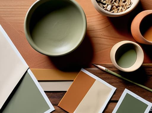
I remember standing in the middle of my first studio apartment, staring at a wall of fifty different beige paint swatches and feeling like I was about to have a literal meltdown. I had spent three hours scrolling through Pinterest, convinced that if I didn’t master the complex mathematics of color theory, my entire life would just look cluttered and wrong. Honestly, the internet makes learning how to choose a color scheme feel like you need a PhD in fine arts just to pick out a throw pillow, and it’s exhausting.
I’m not here to give you a lecture on the technicalities of the color wheel or tell you to spend a fortune on designer samples. Instead, I’m going to give you the low-stress shortcuts I’ve actually used to make my tiny spaces feel intentional without the decision fatigue. We’re going to skip the fluff and focus on a few dead-simple frameworks that will help you pick a palette that actually vibes with your life, so you can stop staring at walls and start actually living in them.
Mastering Color Theory for Beginners Without the Academic Headache
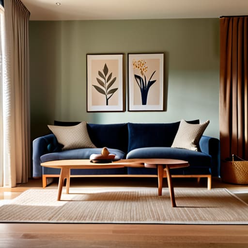
Look, I didn’t spend four years in college to sit through a lecture on the physics of light, and you shouldn’t have to either. When we talk about color theory for beginners, let’s skip the dusty textbooks and focus on what actually works in a real living room. The easiest way to start is by understanding warm vs cool color tones. Think of warm tones—reds, oranges, yellows—as the “cozy sweater” vibe, while cool tones—blues, greens, purples—are more like that “crisp linen sheet” feeling. If you want your space to feel energetic, lean warm; if you want it to feel like a sanctuary, go cool.
If you’re still staring at a blank wall feeling paralyzed, just use the “safe bet” methods. You can go for monochromatic color palettes, which is basically just picking one color and using different shades of it—it’s low-effort and looks insanely expensive. Or, if you’re feeling bold, try complementary color combinations by picking two colors from opposite sides of the wheel. It’s high contrast and high energy, but it’s a foolproof way to make sure your decor actually has some personality instead of just blending into the beige void.
Using Interior Design Color Psychology to Finally Fix Your Vibe
Look, we’ve all been there: you buy a gorgeous sage green rug because it looked “vibey” on Pinterest, only to realize your living room now feels like a high-stress waiting room at a dentist’s office. That’s because interior design color psychology is real, and ignoring it is a one-way ticket to a mood crash. Colors aren’t just visual; they’re emotional triggers. If you want a space where you can actually decompress after a nine-to-five from hell, you need to lean into those soft, muted tones.
If you’re feeling restless, stop grabbing high-energy reds and try playing with warm vs cool color tones to balance your energy. For a chill, sanctuary-style bedroom, think blues or soft lavenders that lower your heart rate. On the flip side, if your home office feels like a cave, adding a pop of sunny yellow can actually help fight that afternoon slump. It’s not about following strict rules; it’s about creating a cohesive room aesthetic that actually supports how you want to feel when you walk through the door.
My Cheat Sheet for Picking Colors Without the Paralysis
- The 60-30-10 Rule is your new best friend. Instead of trying to balance every single shade equally (which is a recipe for a messy-looking room), pick one dominant color for 60% of the space, a secondary color for 30%, and a bold accent for the final 10%. It keeps things cohesive so you don’t end up with a space that feels like a random grab bag of paint swatches.
- Stop scrolling Pinterest for hours and actually look at what you already own. If you have a vintage rug you love or a specific thrifted vase that’s your absolute pride and joy, pull your palette from that. It’s way easier to build a room around an object you already like than to try and force a “trend” color into a space where it doesn’t belong.
- Test your samples in your actual, chaotic lighting. A swatch that looks like a dreamy, muted sage in the store might turn into a depressing, muddy grey once it’s sitting in your dim apartment corner. Grab some cheap peel-and-stick samples and live with them for a few days—see how they look at 8 AM versus 8 PM before you commit to the whole wall.
The TL;DR Version
Stop trying to memorize a textbook; just pick a vibe first (mood/feeling) and let the colors follow that lead.
Stick to a simple formula—like one bold color, one neutral, and one accent—to avoid making your space look like a chaotic fever dream.
Stop Overthinking and Just Start
Look, at the end of the day, you don’t need a degree in fine arts to make your space look intentional. We’ve covered the basics: use color theory to avoid a visual mess, lean into psychology to make sure your living room doesn’t feel like a high-stress waiting room, and keep your palette tight so everything actually flows. Whether you’re going for a moody, maximalist vibe or a clean, minimalist aesthetic, the goal is to create a space that actually feels like you. Just remember to grab a few swatches, test them in your own lighting, and stop letting the fear of a “wrong” choice paralyze your progress.
Your home is a living, breathing thing, not a museum exhibit. If you pick a shade of sage green and realize three months later that it makes you feel weirdly sleepy, you can change it. Paint is cheap; your mental energy is expensive. Use these hacks to build a foundation, but don’t forget to leave room for your space to evolve as you do. You’ve got this—now go grab those samples and make it happen.
Frequently Asked Questions
What do I do if I absolutely love a color that totally clashes with everything else I already own?
Look, I get it. You found the perfect shade of burnt orange, but your living room is strictly beige. Don’t panic and repaint everything. Instead, treat that color like a guest star, not the lead actor. Grab a couple of thrifted vases, a funky throw pillow, or even a cool mug in that shade. It’s called “pop of color” for a reason—it breaks up the monotony without making your whole apartment look like a fever dream.
How many different colors can I actually use in one room before it starts looking like a chaotic fever dream?
Honestly? Stick to the 60-30-10 rule if you want to keep your sanity. That’s 60% a dominant neutral, 30% a secondary color, and 10% for that one “look at me” accent. If you go beyond three or four distinct hues, you aren’t designing a room; you’re designing a headache. You can play with different shades of the same color to add depth, but keep the actual palette tight so it feels intentional, not accidental.